
도영스 공간
[항해99 75일차] 2022.05.20 TIL (리액트 아코디언 메뉴 구현) 본문
반응형
오늘은 디자인이 추가되어 공지사항과 자주 묻는 사항 ui가 나왔다.
..으으..아코디언 메뉴를 구현해야되었었다..
다행히 구글링 도중 아코디언 메뉴를 컴포넌트 화 시킨 블로그를 발견하고 그대로 적용했다.
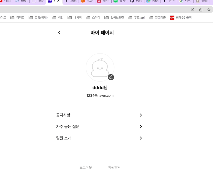
완성된 화면 !!
예전에 제이쿼리랑 바닐라 자바스크립트로 아코디언 메뉴 구현해본 적은 있었는데..
이걸 리액트에 어떻게 적용시켜야될지 막막했었다.ㅠㅠ
우선 아코디언 컴포넌트를 하나 만들어준다.
아코디언 컴포넌트 코드
import React from "react";
import styled from "styled-components";
import { ReactComponent as Down } from "../../assets/arrowbottom.svg";
import { ReactComponent as Top } from "../../assets/arrowtop.svg";

function Accordion(props) {
  const parentRef = React.useRef(null);
  const childRef = React.useRef(null);
  const [isCollapse, setIsCollapse] = React.useState(false);

  const handleButtonClick = React.useCallback(
    (event) => {
      event.stopPropagation();
      if (parentRef.current === null || childRef.current === null) {
        return;
      }
      if (parentRef.current.clientHeight > 0) {
        parentRef.current.style.height = "0";
        parentRef.current.style.background = "#fff";
      } else {
        parentRef.current.style.height = `${childRef.current.clientHeight}px`;
        parentRef.current.style.background = "#FAFAFA";
      }
      setIsCollapse(!isCollapse);
    },
    [isCollapse]
  );

  const parentRefHeight = parentRef.current?.style.height ?? "0px";
  const buttonText = parentRefHeight === "0px" ? <Down /> : <Top />;

  return (
    <Container>
      <Header onClick={handleButtonClick}>
        {props.title}
        <Button>{buttonText}</Button>
      </Header>
      <ContentsWrapper ref={parentRef}>
        <Contents ref={childRef}>{props.contents}</Contents>
      </ContentsWrapper>
    </Container>
  );
}

const Container = styled.div`
  display: flex;
  width: 100%;
  position: relative;
  flex-direction: column;
  justify-content: center;
  border-bottom: 1px solid ${({ theme }) => theme.colors.darkgray4};
`;

const Header = styled.div`
  display: flex;
  align-items: center;
  cursor: pointer;
  height: 52px;
  margin: 0 32px 0 8px;
`;

const Button = styled.div`
  right: 0px;
  font-size: 14px;
  position: absolute;
`;

const ContentsWrapper = styled.div`
  height: 0;
  width: inherit;
  padding: 0 8px;
  overflow: hidden;
  transition: height 0.35s ease, background 0.35s ease;
`;

const Contents = styled.div`
  padding: 32px 16px;
  text-align: justify;
`;

export default React.memo(Accordion);
QNA컴포넌트
import React from "react";
import styled from "styled-components";
import { Accordion, Bar } from "../components/shared/home";
import { MyHeader } from "../components/my/index";

const QNA = () => {
  const contents = [
    {
      title: "💡 오싹은 어떤 서비스인가요?",
      content:
        "오싹은 사무실과 공유 오피스 매물을 지도에서 모아볼 수 있도록 도와주는 서비스입니다.😊",
    },
    {
      title: "💡 공유 오피스는 무엇 인가요?",
      content:
        "공유 오피스는 업무 공간은 구분지어 사용하되, 회의실, 미팅룸, 화장실, 휴게공간 등은 공용으로 두어 관리비, 통신비 등 부대비용을 절약하고자 고안된 공간 임대 시스템입니다.",
    },
    {
      title: "💡 회원가입을 하면 어떤 점이 좋나요?",
      content: "저희 오싹 서비스를 이용하실 수 있습니다.😇",
    },
    {
      title: "💡 회원탈퇴는 어떻게 하나요?",
      content:
        "마이페이지 탭에 가셔서 하단에 보시면 회원을 탈퇴할 수 있는 버튼이 있습니다.😁",
    },
  ];

  return (
    <React.Fragment>
      <MyHeader> 자주 묻는 질문</MyHeader>
      {contents.map((c, idx) => {
        return (
          <Outter key={idx}>
            <Accordion title={c.title} contents={c.content} />
          </Outter>
        );
      })}

      <Bar />
    </React.Fragment>
  );
};
const Outter = styled.div`
  width: 100%;
  display: flex;
  align-items: center;
  padding: 0 16px;
`;
export default QNA;
생각나는 대로 코드를 작성했더니
잘 되어서 다행이다!!
728x90
반응형
'TIL > 2022 TIL' 카테고리의 다른 글
| [항해99 79일차] 2022.05.25 TIL (https배포 후 소셜 로그인 먹통) (1) | 2022.05.25 |
|---|---|
| [항해99 76일차] 2022.05.21 TIL (리액트 gsap라이브러리 사용하여 애니메이션 효과 구현) (2) | 2022.05.21 |
| [항해99 74일차] 2022.05.19 TIL (pwa적용) (1) | 2022.05.20 |
| [항해99 73일차] 2022.05.18 TIL (AWS https로 배포) (2) | 2022.05.18 |
| [항해99 71일차] 2022.05.16 TIL (말풍선 테두리 css ) (1) | 2022.05.17 |
'TIL/2022 TIL' Related Articles
more


Comments